Greenlight Product Launches
As Art Director at Greenlight, I led the creative direction across all touchpoints, ensuring a cohesive visual identity that resonated with our audience and adapted to the company’s evolving needs. Collaborating closely with marketing, product, and design teams, I crafted integrated brand experiences across product campaigns, digital assets, and print materials, playing a key role in shaping the brand’s perception, driving growth, and maintaining consistency across platforms.
Below are samples of my work:
Greenlight Infinity
Independence is something teens crave, and parents strive to provide. Enter Greenlight Infinity—a new plan empowering teens to manage money, stay connected, and call for help, all while offering the highest savings rate for teens on the market.
As the creative lead for this 360 product launch campaign, I directed efforts across CRM, web, social, in-app, and acquisition channels to deliver a cohesive and engaging experience for current and prospective customers. By transforming the plan's features into a compelling story and crafting visuals that captured its warm, forward-thinking spirit, I delivered a campaign that resonated deeply with our audience and stood out in the market.
Role:
Creative Direction
Visual Design


Greenlight Family Cash Card
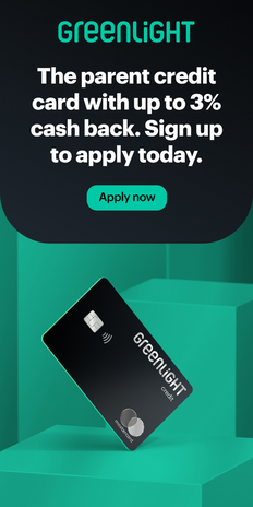
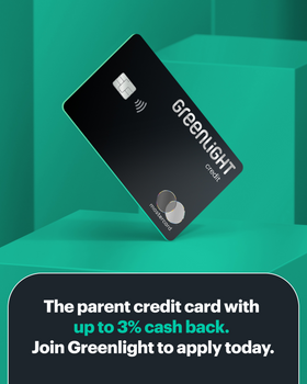
As the Creative Lead at Greenlight, I spearheaded the development of the Family Cash Card, a credit card designed to support families in building and managing their credit. This project aimed to create a financial tool that not only facilitated responsible credit use but also educated families on credit management.
In leading the visual development of the Family Cash Card, I focused on evolving our brand by "aging up" its look and feel to reflect the maturity and sophistication of the product, while preserving the core essence of Greenlight's identity. I leveraged our existing color palette in innovative ways, introducing new treatments and design elements to create a refreshed, elevated look that still aligned with Greenlight's established aesthetic. I worked closely with the cross-functional team to ensure that both the product positioning and go-to-market launch were in sync with our vision of financial empowerment, ensuring that the Family Cash Card resonated with our target audience and stood out in a competitive market.
Role:
Creative Direction
Visual Design


Greenlight Teen Credit
For the launch of the Teen Credit Builder feature, we developed a visual identity that appealed to its youthful nature while staying connected to the core Greenlight brand. This dynamic and playful design contrasted with the Family Cash Card’s more sophisticated look, creating a distinct identity that resonates with teens. The vibrant colors and energetic design elements reinforced the aspirational and forward-thinking spirit of the Teen Credit offering.
To support this, we crafted tailored messaging that spoke directly to teens, highlighting how the feature empowers them to start building credit before turning 18. Additionally, we created a cohesive narrative that ties Teen Credit back to the Family Cash Card, demonstrating how both products work together to provide families with practical financial tools to navigate and manage credit responsibly.
Role:
Creative Direction
Visual Design


Greenlight Welcome Kit
This project was undertaken with the primary goal of rejuvenating our debit card welcome kit and creating a seamless connection between Greenlight’s digital identity and the first tangible interaction our users have with our brand.
Building on the brand essence from the original design, I streamlined the content into bite-sized, easy-to-read sections while revisiting the print colors in our brand guidelines to ensure the update captured the vibrant energy of our digital presence. To inject our mature yet youthful personality, I incorporated custom illustrations that added a unique and engaging touch to the design. I also took responsibility for creating the final print files, ensuring all design elements were properly formatted for production. During print production, I closely oversaw the process, ensuring precise color matching to our brand Pantone and maintaining print quality throughout.
The result is a visually compelling and informative welcome kit that not only excites newcomers to the Greenlight family but also equips them with the essential resources to successfully navigate our product.
Role:
Art Direction
Design
Print Production Oversight
exterior


interior


